


CASE STUDY 05

User Interface Project
Development of brand & mobile shopping app experience
AZURE
I designed the user interface for a conceptual retail brand, focusing on four key screens: homepage, product list, product details, and filter options. After considering various brand ideas, I decided to focus on a jewelry company. I envisioned an app that would feel fresh, modern, and delicately feminine.
Through research and analysis of other shopping apps, I was able to identify features I liked and disliked, helping shape my conception. Preliminary steps included: sketches, layouts, and features, experimenting with several concepts until I settled on a combination that felt right.
The final screen designs embody the aesthetic I was aiming for: a simple, clean color palette, a sophisticated yet feminine tone, and subtly playful typographic touches.
CASE STUDY 05
FINAL WIREFRAMES & PROTOTYPE
Finally, it came together!
The end result successfully reflects the original goals of the project: to create a seamless mobile shopping experience for users. While it was my goal to develop a clean, engaging interface that feels intuitive and gentle, I’m pleased with how it turned out.
Prototyping the wireframes added an extra layer of challenge, highlighting the subtle nuances involved in bringing an interface to life. Although I was able to develop a limited prototype, it’s incredibly rewarding to see the design take shape and come to life in action.
Take a look!
This video showcases a walkthrough of the prototype built from the wireframes - a glimpse of what the app might look like in action.
INDIVIDUAL WIREFRAMES
Feel free to click and enlarge!
01 HOMEPAGE
03 PRODUCT DETAILS
04 FILTERS
02 PRODUCT LIST
THE PRELIMINARY STEPS
STEP 1: Competitive Analysis
Research, analysis, and organization of ideas. Check out a couple examples:
01 SEZANE
02 SAKS FIFTH AVENUE
STEP 2: Sketches
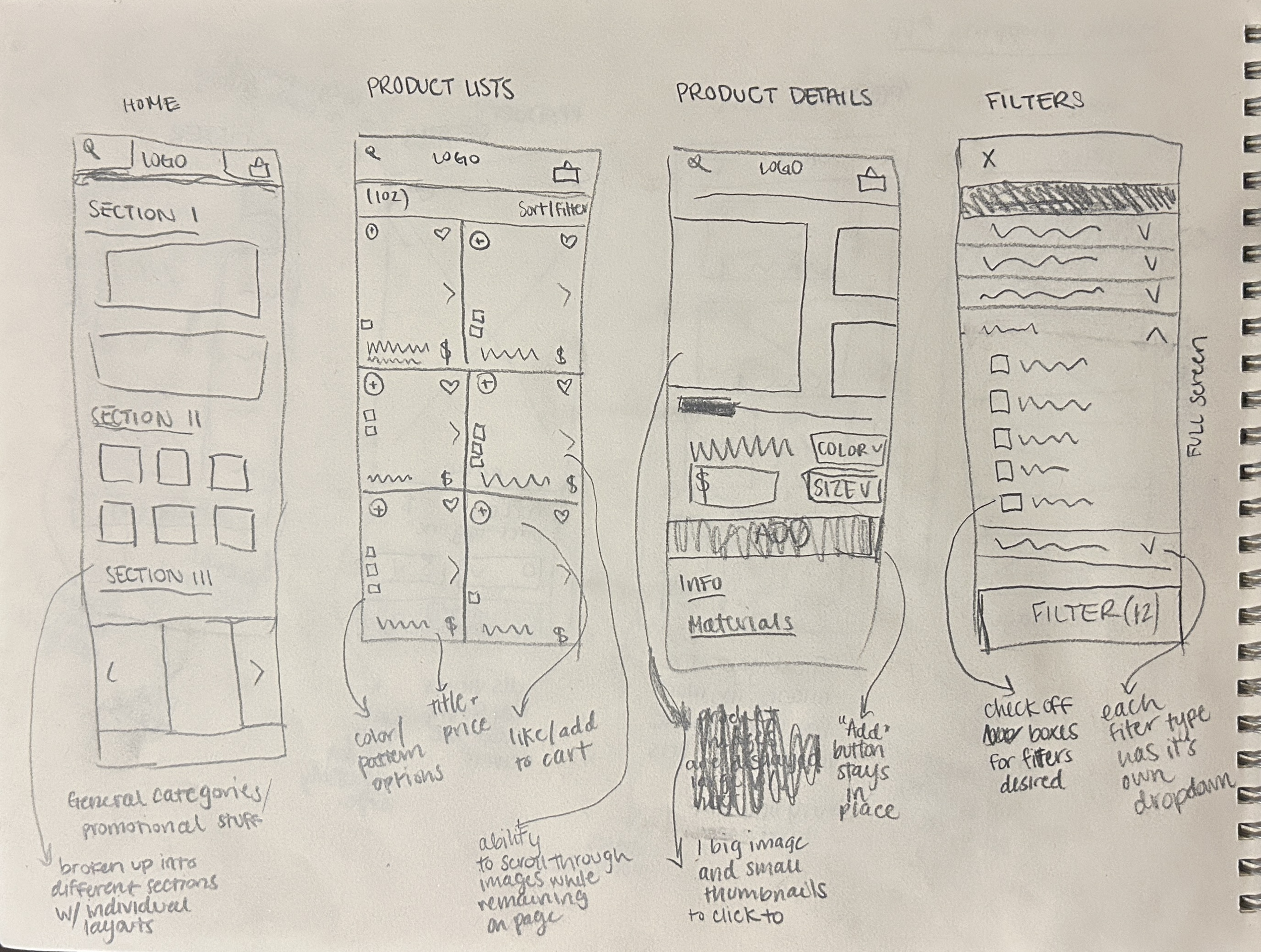
CONCEPT 02
This iteration explores a more distinctive homepage layout and product detail page design. The product list page and filters maintain a standard appearance.
CONCEPT 01
This concept adheres to the traditional shopping app design, featuring a simple homepage and standard product detail pages.
STEP 3: Style Guide
TYPE
For the headline font, I chose Aesthetic for its luxurious, modern feel. To balance this, I incorporated Red Hat Mono for the body text, a friendlier, simpler typeface with a trendy touch. The contrast between the two fonts helps establish hierarchy, creating a more engaging and intuitive user experience.
COLOR
The color palette was refined several times, initially starting with bold colors and gradually transitioning to a lighter, yet distinct, primary hue against a cream background. It's essential to establish a clear branding style, but it should never overshadow the product itself.